The time for having an option to use responsive web design in today’s smartphones and diverse screen sizes is gone. Web design ensures users get a smooth, engaging experience irrespective of the desktop, tablet, or smartphone. This article will take you through the workflow in making a responsive web design, tools and frameworks, and best practices to make user experience much better.
What is Responsive Web Design?
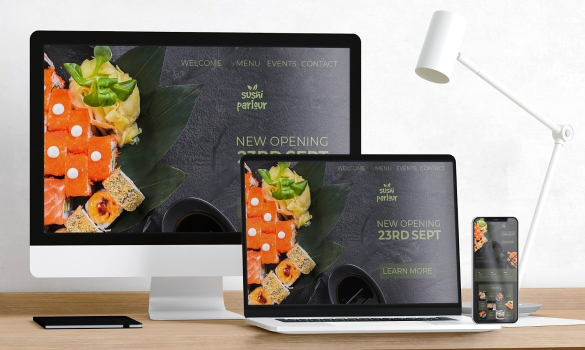
This is an approach to web development in which the website’s layout and content change based on the size and orientation of the device screen. Developers apply fluid grids, flexible images, and CSS media queries to build websites that work and look well on all devices.
Key components:
1. Flexible layouts
Design elements scale proportionally according to the different sizes of the screens.
2. Responsive web design images
Images are automatically rendered to be clear and undistorted.
3. Viewport Meta Tag
Resizes the pages to suit even the smallest available devices.
Responsive design is so important for presenting a seamless experience to the end user and thereby enhancing your website’s performance. Here’s why:
Improved user experience: the responsive website comes with easy navigation and readability.
SEO Benefits: A mobile-friendly website is ranked first on search engines.
Cost-Effectiveness: One responsive site works on all devices instead of creating separate sites for desktop and mobile.
Increased Engagement: A seamless navigation experience keeps visitors around for longer periods and engages more.
Responsive Web Design Workflow
1. Planning and Research
Define Goals: Know what the purpose of the website is, as well as the target audience.
Content Strategy: Organize and prioritize content in all screen sizes.
Wireframes: Sketch layouts for different breakpoints (desktop, tablet, mobile).
2. Design Stage
Grid: Apply a flexible grid for flexible layouts.
Font Selection: A fluid scale while the font type will remain easily readable.
RWD Images: Optimization for smooth rendering in case of good internet speeds.
3. Development
Semantic HTML /CSS media: Ensure semantic structures to make strong groundwork for rendering pages in handheld devices.
View port Meta: add the lines for scaling i.e <meta name=\”viewport\” content=\”width=device-width, initial-scale=1.0\”>.
Testing: Testing on different devices and browsers to discover inconsistencies and solve them.
4. Deployment and Optimization
Performance Optimization: Minimizing file size, compressing images, and using caching.
Analytics Integration: Adding tools such as Google Analytics in order to analyze user behavior.
Ongoing updates: Improving the website through user feedback.
Tools and Frameworks for Responsive Design
Building responsive websites is much more efficient with the right tools and frameworks.
Popular Frameworks
Bootstrap: Offers pre-designed grid systems and components.
Foundation by Zurb: Offers responsive templates for quicker development.
Useful Tools
Adobe XD and Figma: Useful for designing and prototyping responsive layouts.
Responsive Design Checker: To check your website on different screen sizes.
Image Optimize: For optimizing responsive web design images to load faster.
Website Development: Best Practices
Here are the best practices while designing a responsive website:
Mobile: First Approach: Start by designing for the smaller screen and then scale up.
Minimize CSS and JavaScript: Leaner code equals reduced load times.
Adaptive Images: Leverage new formats such as WebP to reduce loading times and increase performance.
User Experience
Any responsive website must always put the user first, for a website will not work unless the user likes it.
Simple Navigation: Menu and button options must be easy to navigate.
Readable Text: Make sure the fonts are scaled properly to maintain readability.
Fast Load Times: Optimize assets and reduce server requests for better performance.
Key Challenges in Responsive Design
It has its challenges, too:
Complex layouts: It’s difficult to handle content hierarchy across devices.
Cross-Browser Compatibility: Ensuring consistency in design on various browsers calls for rigorous testing.
Image Optimization: It’s sometimes difficult to achieve a good balance between quality and speed.
How Shag Infotech Makes Your Website Shine on Any Device
We specialize in responsive web design at Shag Infotech. No matter what the user uses to reach the website, we can captivate that audience. Our latest tools, frameworks, and techniques go into developing highly optimized visually attractive websites, meeting the performance requirement while keeping abreast of all planning and development steps to final testing and deployment of the site for meeting all the modern standards while exceeding users’ expectations.
Conclusion
Responsive web design has now become one of the cornerstones of new development, creating and making accessible an engaging online site on diverse devices. Focusing on an integrated workflow along with the necessary tool sets as well as giving maximum importance to the user’s needs, an online business website may be well planned to get along well, at least up to the era, by incorporating the best from responsiveness in design.
